
Annonse
Sublime Visualisations of Immensely Big Data
Published
You know those visualisations that show you so much data in such a breathtaking manner that you just stop still for a moment and stare in awe? Recently, scholars have started talking about them as playing upon the sublime. The “absolute magnitude” of the data (as Kant might have said) is beyond human comprehension, and that gives the observer the sensation of experiencing the sublime, much as the 19th century wanderer looked upon vast mountains or surging waves and felt awe. Perhaps you’ve sensed that awe, that feeling that you cannot fathom what the data means but it is big and important. But are sublime visualisations useful? And if so, for what and for whom?
The sublime is an old concept, used first by Longinus around 2000 years ago. For Longinus, the sublime was a rhetorical technique used in a speech to “overcome the rational powers” of an audience. The audience is “ravished, or more disturbingly, raped by the power of words,” Philip Shaw explains (p. 5).
Certainly some data visualisations are very much rhetorical attempts to convince an audience. Interestingly, though, the main rhetorical claim of the data visualisation is that it shows us the data. Just the facts. Data visualisations seem to appeal to our rational minds, they give us a “fantasy of knowing”.
Kant is probably the most well-known theorist of the sublime. While Longinus theorised the sublime as a rhetorical technique for influencing people, Kant saw it as a human response to grandeur in art or nature. He differentiated between the dynamical sublime, where you’re basically terrified of what you see but are observing it from a safe space, and the mathematical sublime, which is more relevant for data visualisations. The mathematical sublime is awakened in us when we sense something that is absolutely large, it isn’t of a specific size, it is great without comparison, so that we can’t grasp it mathematically. So if you’re looking at Mount Fløyen and thinking that’s quite a big mountain, bigger than Løvstakken, but not as big as Ulriken, then you’re really not experiencing the sublime. But if you gaze at the night skies, or look at a painting of a mountain that makes it look simply overwhelming, or consider undying love or loyalty, then you may experience the sublime. The sublime, for Kant, lies not in the object but in our experience of it. So I may experience the sublime when I zoom through Strava’s Global Heatmap, or look at images of earth as seen from space, but these things arenot sublime in themselves. If they do evoke the sublime in me, it is I can only apprehend them but not fully comprehend them, in Kant’s terms— the data shown is so absolutely large that I cannot calculate it or rationally understand it. Some of the pleasure of the sublime, Kant writes, is in the sense that our mind is broadened by this experience of the infinite that allows us to “pass beyond the narrow confines of sensibility” (Kant, Critique of Judgement, OUP 2007, §26, p 256).
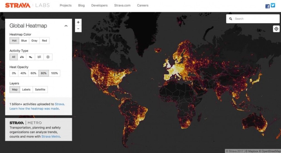
Big isn’t always a big enough word for big data. Take Strava’s Global Heatmap, for instance, which visualises runs and bike rides of users all over the globe. It is, I read on a blog post introducing it, “the largest, richest, and most beautiful dataset of its kind”, and includes:
Annonse
- 1 billion activities
- 3 trillion latitude/longitude points
- 13 trillion pixels rasterized
- 10 terabytes of raw input data
- A total distance of 27 billion km (17 billion miles)
- A total recorded activity duration of 200 thousand years
- 5% of all land on Earth covered by tiles
- That’s huge. Immense. Maybe it is even “absolutely large” in the sense that Kant wrote of when talking about the sublime.
When you open the Strava Heat Map, you see a lit up map of San Francisco. If you’re like me, and not from San Francisco, the first thing you might do is to type the name of a place you are more familiar with into the search bar. The map zooms out, flying you across the world to zoom into a new place, that vertigo-inducing zoom that we know now from Google Earth and countless other maps, that orients us instantly as global.
The map of Bergen I see has paths of light drawn across it like the glow of sparklers against the sky on New Year’s Eve. When I add the familiar satellite map as a layer below the lights I see that the paths chosen are quite different from those highlighted by Google Maps: they show that people have chosen the scenic routes, along the water’s edge, up the twisting streets of Mount Fløyen and across the mountain paths.
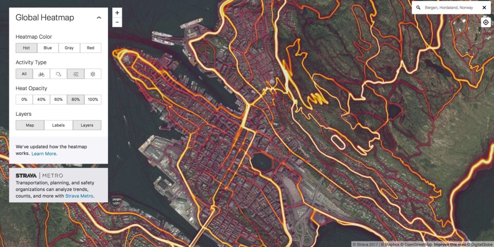
So is this even a data visualisation? Isn’t it just a map?
It’s a data visualisation. The lines of light are visualised numerical data. Maybe it’ll be clearer if you look at another visualisation of some of the same data that goes into the Global Heatmap:
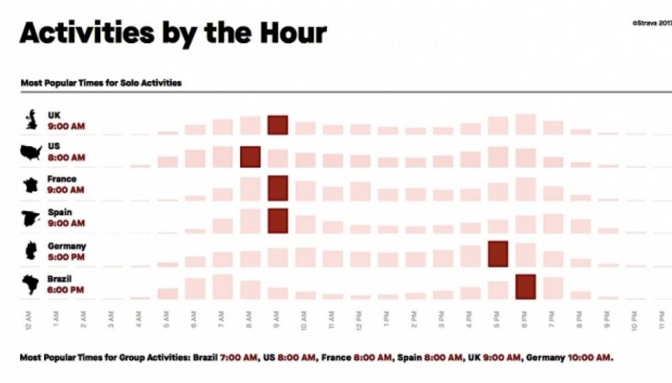
Much more prosaic, don’t you think? I certainly don’t feel any awe when I look at this image. No awe for this one either:
Both of those visualisations are useful and can be used to support certain argumnets. Strava’s global data is used by geographers, urban planners and activists to design better cities or figure out better ways to support healthy populations — do a google scholar search for Strava and you’ll find quite a few publicatisons doing this. Arguably, the Global Heatmap images are as informative as the visualisations above, they just visualise different aspects of the data. But the times of day visualisation and the Glasgow activists comparison visualisations don’t evoke the sublime as the Heatmap does.
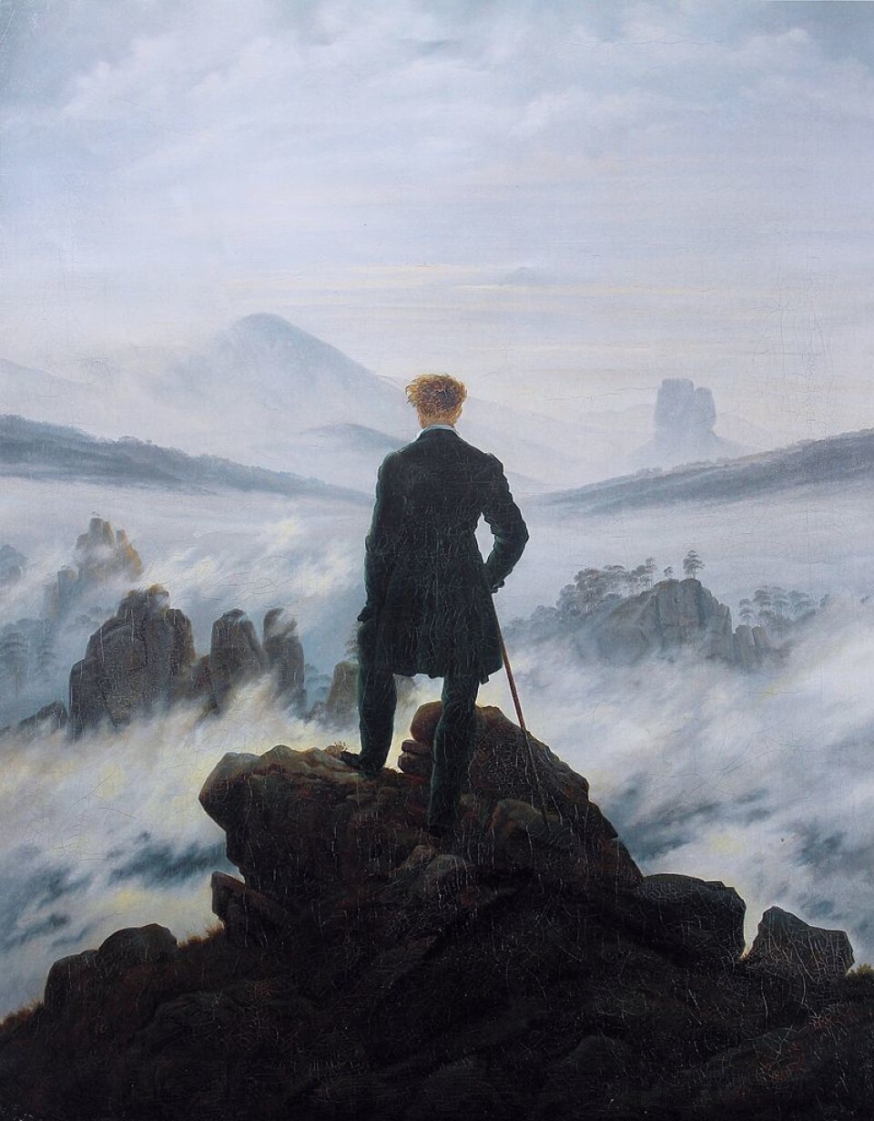
Is my sense of awe, of something sublime when I look at this just that I know what the mountain and the fjords look like, and I imagine myself looking upon them like Caspar David Friedrich’s “Wanderer”?
I don’t think so. I think the “absolute greatness” of the data itself is what I am in awe of. And it’s not just a sense of awe at this particular map, but at the global heatmap. I got to this map by zooming past a globe full of data that surpasses my ablity to count it or fully comprehend it. Simply by zooming out and over a map representing a spinning globe, we are reminded of how tiny we are against the globe. That framing is very important.
The lights against dark have some of the same awe-inducing effect: look at these traces of shared humanity against the darkness of the night, of the unknown. We recognise this image from the composite images NASA has created of the globe as seen from space:
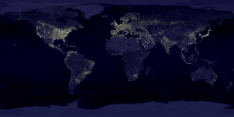
In fact, even this familiar images is a visualisation of numerical data. It isn’t a photograph, it’s not even a composite image created from several photographs. It’s a compilation of data points measuring light intensity from various places on Earth as measured from several different satellites over a period of half a year. The data isn’t raw, it’s been “cooked” by reducing the intensity of some lights to make the cities more clearly visible.
Of course, the choices made in both the Strava Global Heatmap and NASA’s visualisation of light on Earth also reiterate the old metaphors of civilization against darkness. Africa is dark for NASA and Strava, just as it was in old maps. In NASA’s case, the use of light and darkness relates directly to the data that is visualised: lights as seen in the night. Strava, on the other hand, has made a conscious choice to use light to visusalise their users’ activities.
Data visualisations are not simply visual and they are not simply quantitative. They are a form of communication that emphasises data, and beyond that, a world that can be understood as a model. Sometimes it is the very fact that they present reality as understandable and predictable through data models that makes data visualisations so convincing.
So if the presentation of absolutely large data (“the largest, richest, and most beautiful dataset of its kind”) can evoke the sublime, is it in Longinus’s sense, where it assaults us, bypassing our rational minds to convince us through pure grandeur? Or is it a more Kantian sublime, that broadens our minds through the pleasurable tension between our imagination of the infinite and our ability to rationally comprehend it?
Annonse
When we see immensely big data visualised, like these global maps, it is imoprtant to remember that they are not in fact infinite. So much is left out. So much “troubling detail” (as Johanna Drucker notes in Graphesis, p. 92). And so often, the “troubling details” are what tell the most important stories.