Annonse
Spider webs and other sources of ideas
The potential future path of a hurricane, the news network around Donald Trump and Vladimir Putin or the development of the earth temperature – these are just three examples of what a data visualization can show. It can make the invisible visible. That means, that somebody makes a decision on how this invisible phenomenon should look (and in some cases behave or sound).
These decisions should not only reflect this somebody’s personal preferences.
No, the goal is to create something that is understood by other people too.
What a job! It’s a translation task, only that the translator has no help of a dictionary. But what are these translation decisions based on then? Where do the ideas for a certain representation come from?
There are certainly conventions that might give designers a direction, a possible way to go. And of course different data visualization types (like network diagrams, route maps or line graphs) come with a set of rules about how certain things have to look. Likewise, certain tools to develop data visualizations allow certain forms of representations while others are suppressed. Anyway – somehow these conventions, data visualization types and developer tools have been built up first, right?
Annonse
While stepping out of my office and away from the computer, I asked myself:
Can I find approaches in the non-digital, experienced world, that are used in data visualizations?
A few minutes later, I almost stepped in a spider web which made me think of the connection visualizations on this page:
1. https://news-explorer.mybluemix.net/ (If you click on one of the “trending connections” it creates a news network for you.)
Now compare it with this one:

Isn’t the look and feel somewhat the same? The spider silk is super elastic, just as the single connection lines in the visualization are. If you act carefully, you could even relocate an endpoint of such a spider thread, or if you let it go it suddenly reorders the whole web. Is this also possible in the data visualization?
As another example, look at the next photograph, and compare it with the lines in these data visualizations:
2. https://projects.fivethirtyeight.com/flights/ 3. https://www.bloomberg.com/graphics/2016-who-marries-whom/
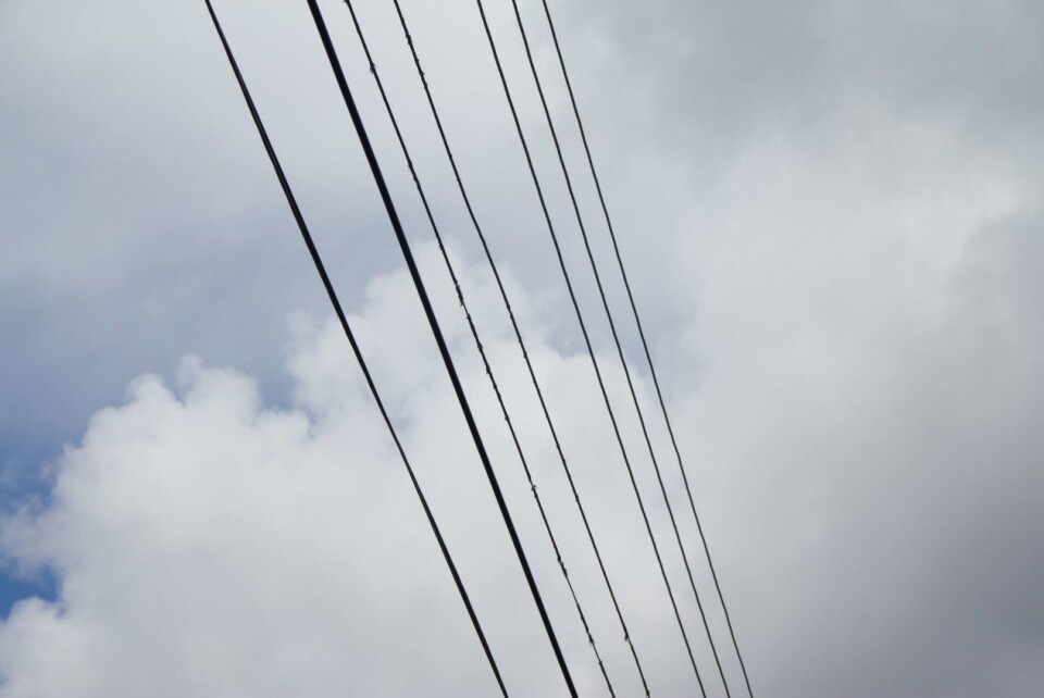
In the photograph the line thickness can be seen as an indicator of the current strength, because the current determines the power line thickness (although it is also dependent on several other aspects such as insulation). In comparison, in these two visualizations the line width shows how strong the connection is (besides using color to show certain characteristics of the connections). To be precise: The broader the lines are in the flight visualization, the more flights are performed between those cities. The broader they are in the third visualization, the more likely it is that persons with these jobs get married.
Such parallels could be found in several other non-digital observations. To mention a few examples, water pipe thickness, road width or rope thickness, in a wider sense all show how strong the connection is or potentially could be. This means that such experiences might be a potential source for ideas for deciding on how something invisible could be made visible.
Looking back on these two examples the question is: Do we already use the full potential? Are there still undiscovered hints around us, which could lead to new approaches to how elements in data visualizations could look and feel? And ultimately, can these approaches be used to make the invisible not only visible, but also understandable?
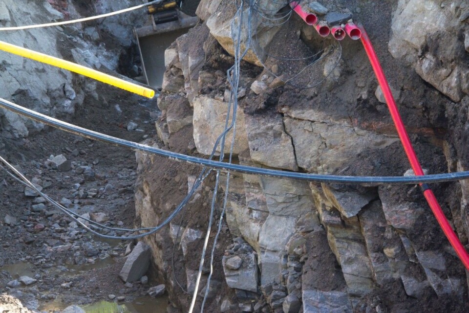
Let me end with a photograph of a construction site and a plea for attentiveness and creativity including all senses. Looking at these different materials, surfaces, behavior patterns of the cables and pipes, isn’t our non-digital, experienced world a perfect playground for data visualization designers?