
Do graphs and charts make you a wiser person?

What effects do the growing number of graphs and diagrams have on the news that we read on news sites, or watch on TV? Do they make them easier to understand or more trustworthy? Do you become a wiser person, due to the graphics? Or do you regard them as mere decorations?
Welcome to our blog about the use of data visualization in today’s society!
There is a research group of 9 behind this blog, who will work together for 3 years with researching different aspects of this special way of communicating – through graphs, diagrams, interactive maps, and so on.
How do they actually work, these (oftentimes) colorful graphic representations, and how do they affect our communication? And how can we learn to read them both critically and effectively? These are the types of questions we ask in our project. The blog will be updated frequently, and the members of our research group will take turns writing in it. If you want to know more about our research project, feel free to take a look at our website: indvil.org.
A separate «language»
What is so interesting about graphs and diagrams, or what we collectively call data visualizations? These graphic presentations of statistics and other forms of numerical data communicate in a completely different manner than what e.g. words or photographs do. Some people are comfortable with x-axes and y-axes, with lines and bars and colorful pie charts. Others skip over these types of expressions when they meet them. These expressions actually constitute their own “language”, with its own “grammar” and “vocabulary”, and becoming a skilled user of them requires practice – whether you find yourself at the sender’s or recipient’s end of it.
This language is far less explored than our verbal language, and few were taught it in school. However, we see that data visualizations are becoming more prominent in important areas of society – including the news, in public information and in many workplaces. The reason for this is, among other things, that the amount of available data is rising rapidly. Think about how web traffic, economic transactions, medical data (are you perhaps currently wearing a pedometer?), sports results, traffic data and so on automatically become registered and saved in the form of more or less systemized data sets. In order to be useful for most of us, this means that the data need to be visualized, they need a graphical “face”.
Interactive visualizations
In order to visualize numeric data, more and more advanced, yet more user-friendly digital tools are being used. This means that more people are capable of making data visualizations today than only a few years ago. This also means that the data visualizations you will find in e.g. the news can be quite creative when it comes to shape and form. In addition, they can be interactive; you can explore the data sets yourself.
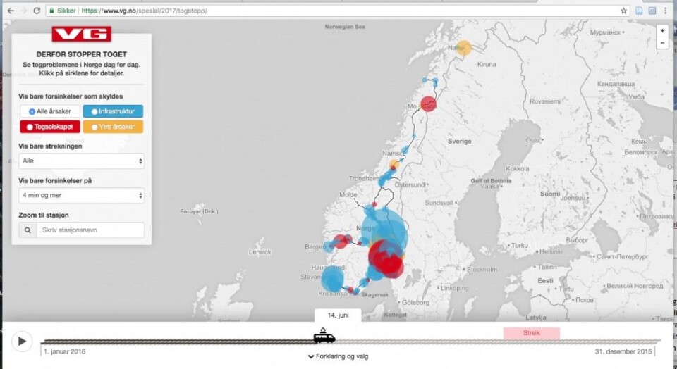
The illustration below is an example of such an interactive data visualization, where VG, the most popular newspaper in Norway, invites you to explore how often the train was late at your specific train station in a certain period, and the reasons for every single stop.
Training a critical eye
What effect do these expressions have on such a genre as the news? They can obviously contribute to put the events of today in a larger context by showing the development over time, or what is most normal or abnormal. It is much easier to find a pattern when we study statistics in visualized form. At the same time, data visualizations can easily be used to manipulate, since those who make the visualizations need to consider quite a few issues during the process.
What data should we include? What color should the different bars in the bar graph have? How large should the intervals on the x-axis or the y-axis be in the line graph? The last question affects e.g. how steep a curve becomes, and as a result, whether the reader perceives a change to be small or large. All these choices are part of a process that is not very transparent for us who meet the visualization in e.g. an online newspaper. And it is easy to forget that aspect of the matter anyway, since the product in itself seems so objective and convincing. A bar graph simply tells the truth – or what?
Do you meet data visualizations in your everyday life – at school, at work, or when you read the news? Or do you use them yourself when you are presenting information to others? In which case, you are more than welcome to follow our blog, and our Facebook-page with the same name. Feel free to ask us questions or leave comments both places. Everyone will receive a response!