

Annonse
A good reader discovers what he does not understand
Published
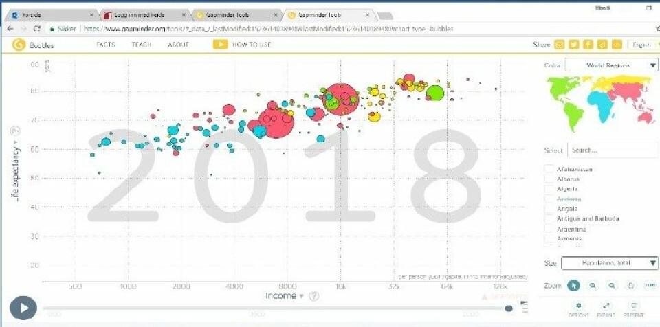
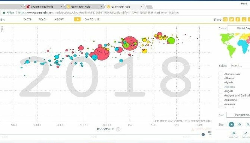
Two young boys are hunched over a computer. They are working on a task about population trends in social studies, and are using the website Gapminder to find answers and connections. To begin with, they explore the tool the way it has been set up to show the relations between average income and life expectancy. They go through an animation of the developments from 1800 until today:
"The yellow ones are Europe"
"Africa’s not doing well"
"I don’t understand – this one is bouncing up and down. Whoa, what happened there?"
"It was World War II"
Annonse
"No, World War I"
"And now we’re on World War II"
"Whoa, it’s like a trampoline"
The boys are going through the animation almost as though it were a thriller. They note drastic changes, first and foremost about life expectancy, and try to connect them to their existing knowledge about the history of the relevant countries. Among other things, they are looking at changes that happened due to the World Wars, the Wall Street Crash of 1929, and the Khmer Rouge regime in Cambodia in the 1970s. This means that, in this phase, they are using Gapminder as a resource for confirming what they know and expanding upon that knowledge.
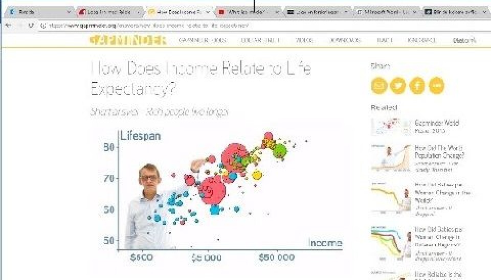
Big data is rapidly making its way into schools, and in order to use them, the students need to learn how to read graphic representations. As part of our INDVIL project, we are researching how high school students read these kinds of statistics, what they could learn from them, and what potentially could hinder their learning. It is about a specialized form of reading skills which requires knowledge about statistics, and about visual conventions for how graphs make meaning.
The curriculum in social studies consider the students aspiring researchers. Among other things, the curriculum expects them to use a variety of digital search strategies and discuss concurrent and contradictory information. In other words, the curriculum presents a wet dream about critical, independent and curious readers, who have access to infinite amounts of information through digital sources.
But does it work in practice? Social studies teachers we talked to say that a few students in each class have the potential to read these kinds of sources and use them actively. On the other hand, there are quite a few students who never get started engaging with the graphs, because they do not see the point. And then there is the majority in between, who need a strict plan from their teacher in order to ask relevant questions about the graphs and find interesting answers.
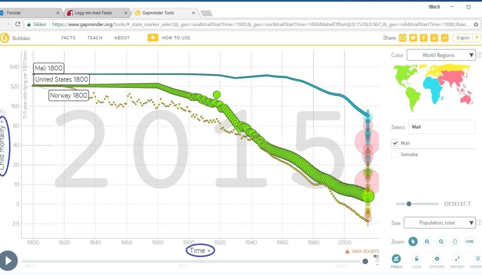
We were allowed to participate in one of these teachers’ classrooms, where we could follow the students’ reading process closely by recording the screen they were working on. In addition, we taped the conversation between the pairs of students working together on the tasks. The task is set up so that they will initially acquaint themselves with Gapminder’s bubble diagram, which we have showed a screencap of below. After this, they did some specific searches the teacher had defined, and interpreted those, and then they were finally free to choose the problem for discussion and country on their own.
The two boys we used as an example work focused on the tasks for about 40 minutes. They are advanced students who have chosen to specialize in social geography. We noted several signs of good learning processes in our observations:
• They are formulating expectations for what the graph will show, activating their pre-understanding • They are connecting their background knowledge to the information they find in the graph • They are explaining terms to each other • They go back and examine the graph more closely when they come across surprising information
However, they could have learned more if they had used the full potential of the website. For example, they are not using the help videos directly below the graph they are investigating, where Hans Rosling gives a short instruction on how the graph could be read. And even though they notice that the teacher used the term “logarithmic scale” in the task, they do not ask what it means.
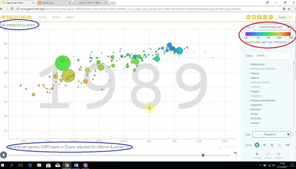
Towards the end, there is a small slip that lead them astray. They are told to change the value of the axes in the graph. The teacher tells them to investigate how child mortality has developed through history, and they must therefore choose “Time” on the X-axis and “Child mortality” on the Y-axis. However, they miss out on how to change the values of the axes (see the elements circled in blue below). Instead, they try to use the search box on the right side of the graph (circled in red in the left graph). This way, they are marking the child mortality with the colors of the bubbles, so that cold colors like blue or green show low child mortality, and warm colors towards red show high child mortality. The graph they get (to the left below) is hard to read intuitively. When they answer the question, they start off by saying “In the US and Norway, infant mortality developed steadily upwards”. But this is corrected when they write down the answer to “In the US and Norway, infant mortality developed in a positive direction”. This way, they correct the answer based on their background knowledge, but not from reading the graph. If they had changed the value of the axes, they would have gotten the graph on the right below, where you could easily follow the development of the three countries they were to compare, and where a negative variable like child mortality would logically go down, and not up, when the living standards improve.
I have been interested in literacy for a long time, and among my possessions, I have a list of what the Swedish reading scholar Ingvar Lundberg thought characterized bad readers. Two of them may fit well in this example: A reader who does not notice that he does not understand, and does not ask questions, will not learn anything new from the reading. If the students of today are to live up to the curriculum’s ambitious goals of reading statistics to see connections and ask critical questions, they need to understand what they do not know or understand and learn how they can find out.
Translated from Norwegian by Nikolas Aleksander Strømsnes.