Norwegian evidence map may be one of the world's most systematic overviews of research on COVID-19
The Norwegian Institute of Public Health is compiling and categorizing global corona research in what will be one of the most complete resources on COVID-19 research in the world. The research map will soon also include quality assessments of the studies.
This effort will make it easier to find research that can really help the world’s scientists.
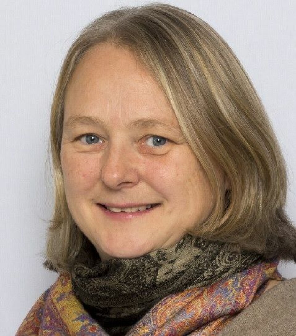
“When we published an updated version of the visual evidence map this Wednesday, we had looked at more than 10 000 publications,” says project manager Gunn Elisabeth Vist at the Norwegian Institute of Public Health (NIPH).
The NIPH project has come together extremely quickly.
The evidence map on COVID-19 gives researchers an opportunity to see studies and research in context, and studies with the same aim together. This makes it easier to find out if researchers have come up with the same results, or if their findings are different.
The evidence map can be found here.
More than 1000 research studies
Vist notes that more than 80 per cent of the published articles are not actual studies. Many are commentaries written by professionals in various medical journals.

“But we will have more than 1,000 actual studies in place and categorized in the next update,” she says.
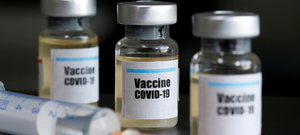
The NIPH’s evidence map provides a detailed overview of research on the COVID-19 pandemic related issues such as infectiousness, immunity, effects of measures such as the use of masks, school closures, vaccine development and treatment.
The map also includes studies on interventions on system level and the consequences (wanted and unwanted) as well as how the population and health care workers experience the pandemic.
Also included are effects on political, ethical, societal and economic levels.
A good deal of research also concerns how deadly COVID-19 is.
Illuminates research gaps
The new database thus shows what kinds of research has been conducted. Implicitly, it also then gives an idea of what remains to be studied.
In this way, the NIPH evidence map illuminates the areas where researchers and policy makers need to know more.
A great deal of research on the virus and the pandemic has been conducted very quickly and with limited opportunities for quality assurance. The NIPH therefore plans to start assessing the quality of the studies.
Doctors describe their experiences and suggestions for further action
Medical journals publish many short articles in which researchers and doctors comment on studies that other researchers have conducted. They also publish shorter articles in which health professionals talk about various issues.
These types of articles may describe issues that the author thinks are important and that their colleagues should pay special attention to. For example, Norwegian doctors have pointed out that COVID-19 patients who are terminally ill may need extra painkillers.
Other articles describe special symptoms of the coronavirus disease that authors want their colleagues to know about.
“Only a minority of what we have collected so far are studies with primary data. A great deal includes commentary and what medical journals call Letters to the Editor and Correspondence. Although they sometimes do, these kinds of articles usually do not contain primary data,” says Vist.
The most comprehensive and detailed COVID-19 resource in the world?
The NIPH of course isn’t the only organisation that is trying to compile information on international COVID-19 research.
In Norway for instance, the Norwegian University of Science and Technology have created a COVID-19 research database, and the US National Library of Medicine have a curated literature-hub which tracks COVID-19 research. These are but two examples.
But the NIPH evidence map is probably the most comprehensive in systematizing and coding all international research on the coronavirus and the pandemic, according to Vist.
"The most important difference between our evidence map and database efforts from around the world, is that we are systematically categorizing each study according to different dimensions", she says.
All the studies are coded according to different themes, as well as study design, and thematic links to patients or health personnel. This is then presented through a so-called evidence map.
“For instance, if you want to know about prognostic factors in a certain population, you can find the studies on children already coded together, or those with a pre-existing comorbidity together, and so on”, Vist explains
"The difference will be even greater when we get started on assessing the quality of the studies", she adds.
But rather than comparing databases and evidence maps, she would like to talk about collaboration between them.
"We are in touch with several others who have made databases, or like us, evidence maps. And there are discussions on how we can share data and other ways of collaborating", says Vist.
Will be updated every week for the foreseeable future
Although there are people working on the database daily, the NIPH plan is to update the COVID-19 research map only once a week.
"Even though the pace of new research on this is extremely high, we have to ensure and prioritise quality", says Vist.
"It's important that we get the coding right."
The majority of the studies - also the ones published by the NIPH themselves from now on, are in English. But Vist says they do wish to include studies in all languages.
The effort also includes a weekly newsletter that you can subscribe to here.
Source:
Dagens Medisin. Norway: Worldwide COVID-19 visual evidence map aims at including all published research. 3 April 2020
This article was updated on April 30 at 18:18. The previous version stated that NIPH had looked at more than 5200 publications, this was changed to 10 000 publications.
———


