Norway’s mortality rate during the coronavirus pandemic is probably lower than usual
So far this year — during the coronavirus pandemic — the number of deaths in Norway is probably below the mortality rate from the same weeks in previous years.
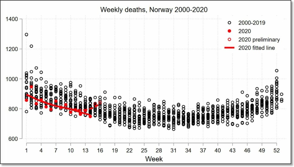
In a normal week, somewhere between 700 and 1,000 people die in Norway.
But in recent weeks, mortality in the country has probably been below normal for this time of year, figures from Statistics Norway show.
Statistics Norway fairly confident about the figures
“Based on the experience we have with these weekly mortality figures from previous years, we feel pretty confident that this is true,” says Magnus Haug at Statistics Norway (SSB).
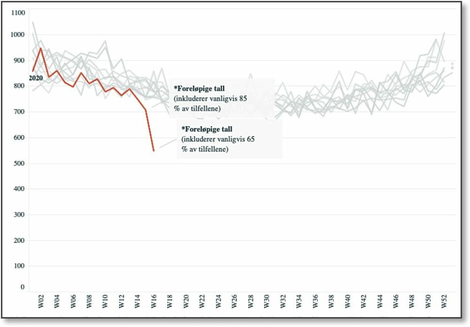
When SBB receives reports of deaths, there is always a delay. SSB reportedly receives reports for 65 per cent of all deaths from one week back in time, while for two weeks back, the agency has received reports for 85 per cent of all deaths.
But when statisticians go back 4-6 weeks in time, they feel pretty confident about their numbers in terms how many people have died in Norway.
BI professor made chart
John H. Fiva is a professor of economics at BI Norwegian Business School. Based on Statistics Norway's figures for mortality, Fiva made the chart you see at the top of this article. Fiva's chart shows the past two weeks as being uncertain.
Fiva is not a specialist in health and mortality. But when the BI professor saw that a graphic like this had been made for other countries, but was missing in Norway, he decided to create it himself.
In the table below, Statistics Norway has included the figures for the number of deaths in the last 20 years in a diagram. Here the red line represents 2020, and clearly shows the same trend as in Fiva's chart.

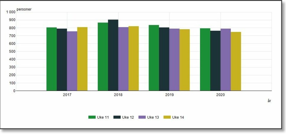
The bar chart below shows the numbers of deaths during weeks 11 to 14 for the last four years.

High mortality in other countries
The mortality trend in Norway is completely different from many other countries.
Figures that The New York Times has collected from 14 countries around the world show a clear excess mortality rate in recent weeks compared to similar weeks in previous years.
Not only are more people dying of COVID-19. The figures also reveal that more people are dying from other disorders, perhaps because they cannot be treated in hospitals where capacity has been overwhelmed during the pandemic.
At least 46,000 more people have died in these 14 countries than the official COVID-19 numbers indicate, The New York Times concludes in the version of the article updated on April 30.
Highest excess death rates in New York
The highest excess mortality rates have been in the city of New York, with 309 per cent more deaths from March 11 to April 25, 2020, compared to the historical average.
In addition to 16,673 deaths from COVID-19, there were 4,200 more New Yorkers than usual for this period who died from other causes.
In Spain, the excess death rate between March 9 and April 12 was 67 per cent. A total of 17,192 people have died of COVID-19 and 9100 more than usual died of other causes.
In France, England and the Netherlands, death rates were not as high as in Spain. Nevertheless, the numbers still show an excess of deaths due to other causes in addition to COVID-19, similar to what has happened in Spain.
In Sweden, the excess death rate between March 9 and April 19 was 18 per cent. A total of 1540 Swedes died of COVID-19 during this period, and 400 additional individuals died from other causes.
Strange figures from Ecuador and Indonesia
Interestingly, the figures from the poor country of Ecuador in South America are quite the reverse of the figures for rich and well-organized Sweden.
In Ecuador, the excess mortality rate during COVID-19 is as high as 83 per cent. This small country has had an excess death rate of 7,600 people over a period of six weeks.
But just 503 people are officially registered as having died from the coronavirus during these weeks.
In Indonesia, the official coronavirus death rates are also very low. But when the Reuters news agency and The New York Times took a closer look at the deaths in the city of Jakarta in recent weeks, they saw something strange.
While around 2,500 people are typically buried in Jakarta's cemeteries during a regular month, the Office of Parks and Cemeteries in the city recorded 1,600 additional burials in March.
Translated by: Nancy Bazilchuk
Sources:
SBB's mortality tables.
The New York Times: “40,000 Missing Deaths:Tracking the True Toll of the Coronavirus Outbreak”, 27 April. Article.
———
Read the Norwegian version of this article on forskning.no


